Designing Onboarding for High-Value Sneaker Buyers
A premium commerce onboarding experience for sneaker buyers spending more than $10k per year, shaped through user research, Figma prototypes, UX writing, and A/B testing.
Some details are generalized or anonymized to protect confidential product, customer, and business information. Test audience sizes are approximated.
- Role
- UX/UI Designer
- Audience
- High-value sneaker buyers, $10k+ annually
- Methods
- User research, Figma prototypes, UX writing, A/B testing
The Problem
Premium onboarding for an audience that demands authenticity
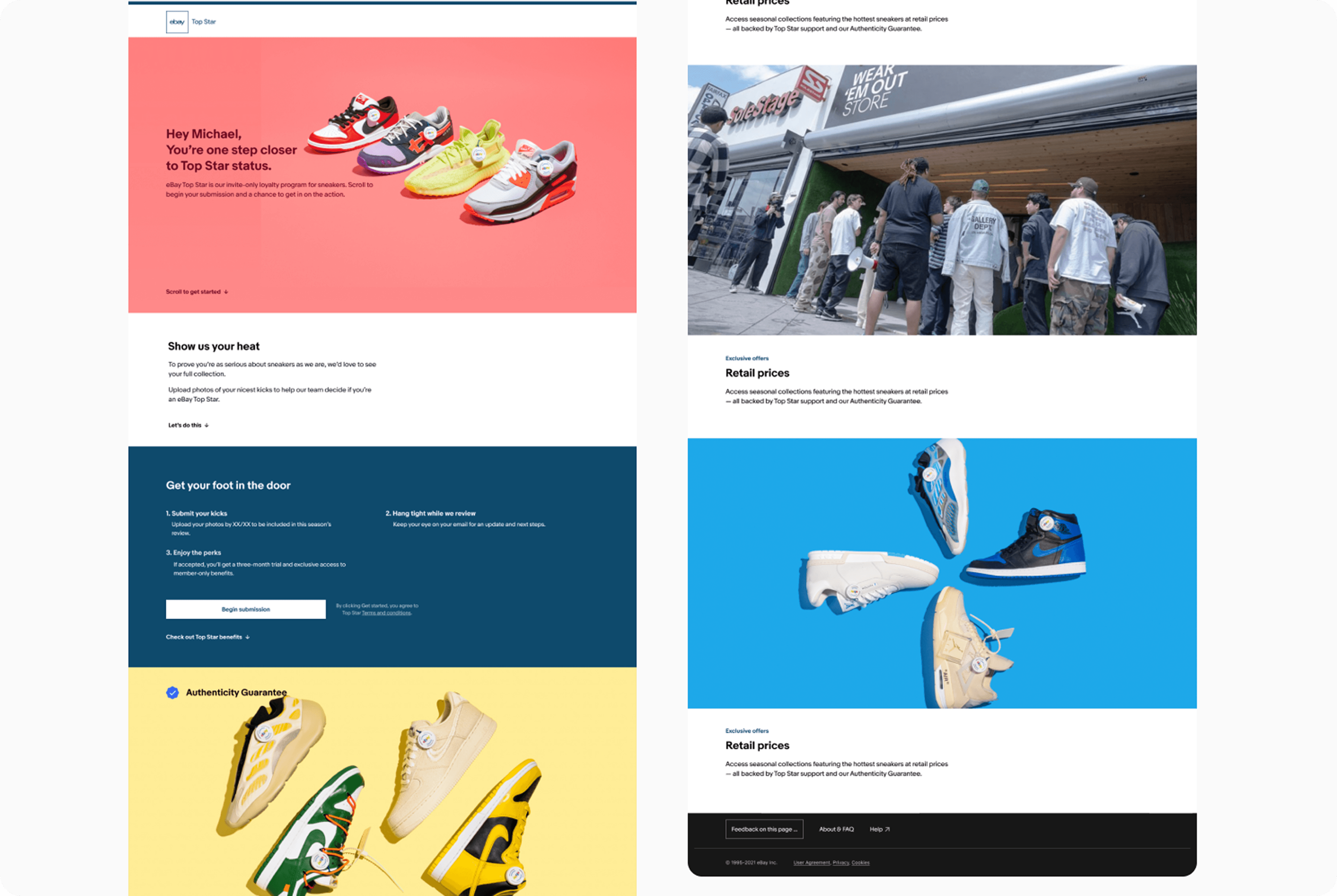
High-value sneaker buyers are not casual shoppers. They are collectors, resellers, trend watchers, and culture participants who know exactly what access, authenticity, and exclusivity feel like. They have seen every generic loyalty program. They can spot one from the first sentence.
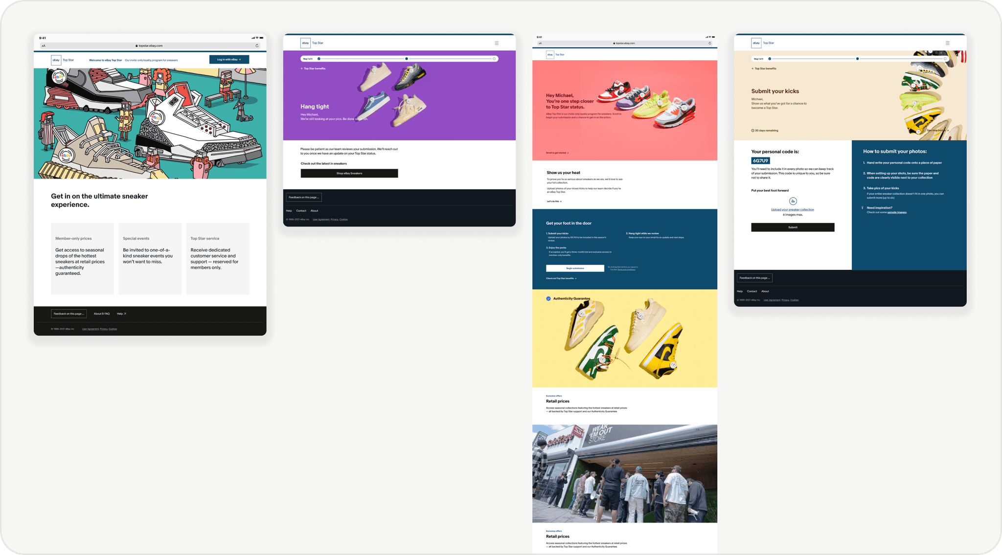
The Top Star program had something real to offer: early access, retail pricing on limited drops, and eBay's Authenticity Guarantee. The challenge was designing an experience that communicated that value in a way this audience would actually believe. Generic premium copy would not work. The onboarding needed to feel like it was built for them specifically.
Research
What research revealed about this audience
High-value users need recognition, not rewards
These buyers had already demonstrated loyalty through their spending. They did not want points. They wanted acknowledgment that eBay saw them as serious collectors, not just high-spend accounts.
Exclusivity only works when the value is concrete
Vague premium language made users skeptical. The experience only converted when benefits were specific: early drops, authenticated rarities, retail pricing. Abstract status language without substance fell flat.
Sneaker culture is built on earning your place
The most important cultural insight was that exclusivity in sneaker culture is not given. It is demonstrated. Collectors expect to prove their credentials. An onboarding that asked nothing felt too easy to take seriously.
The language had to come from the culture
Generic marketing copy created distance. The winning variants used the vocabulary of sneaker culture: heat, kicks, drops, authenticated rarities. The tone had to feel like the category, not like a corporate loyalty program.
Design Decision
Asking users to prove themselves was the right call
Most onboarding flows try to reduce friction as much as possible. For Top Star, research pointed in the opposite direction.
Sneaker culture is built on earning your place. Collectors who wait in line, track drops, and build their rotation over years have zero respect for programs that hand out status for free. An onboarding that asked nothing felt like it was for everyone, which meant it was for no one.
The "show us your heat" step asked users to submit photos of their collection before being accepted into the program. That came directly from research. It was not friction. It was a signal that Top Star was genuinely selective, and that membership meant something. Users who completed it were more engaged throughout the rest of the flow.
A/B Testing
Three tests, one clear winner
I wrote all variants myself, treating copy as a design decision. Each test isolated one variable across approximately 2,400 invited members over 14 days. The results made the design direction clear.
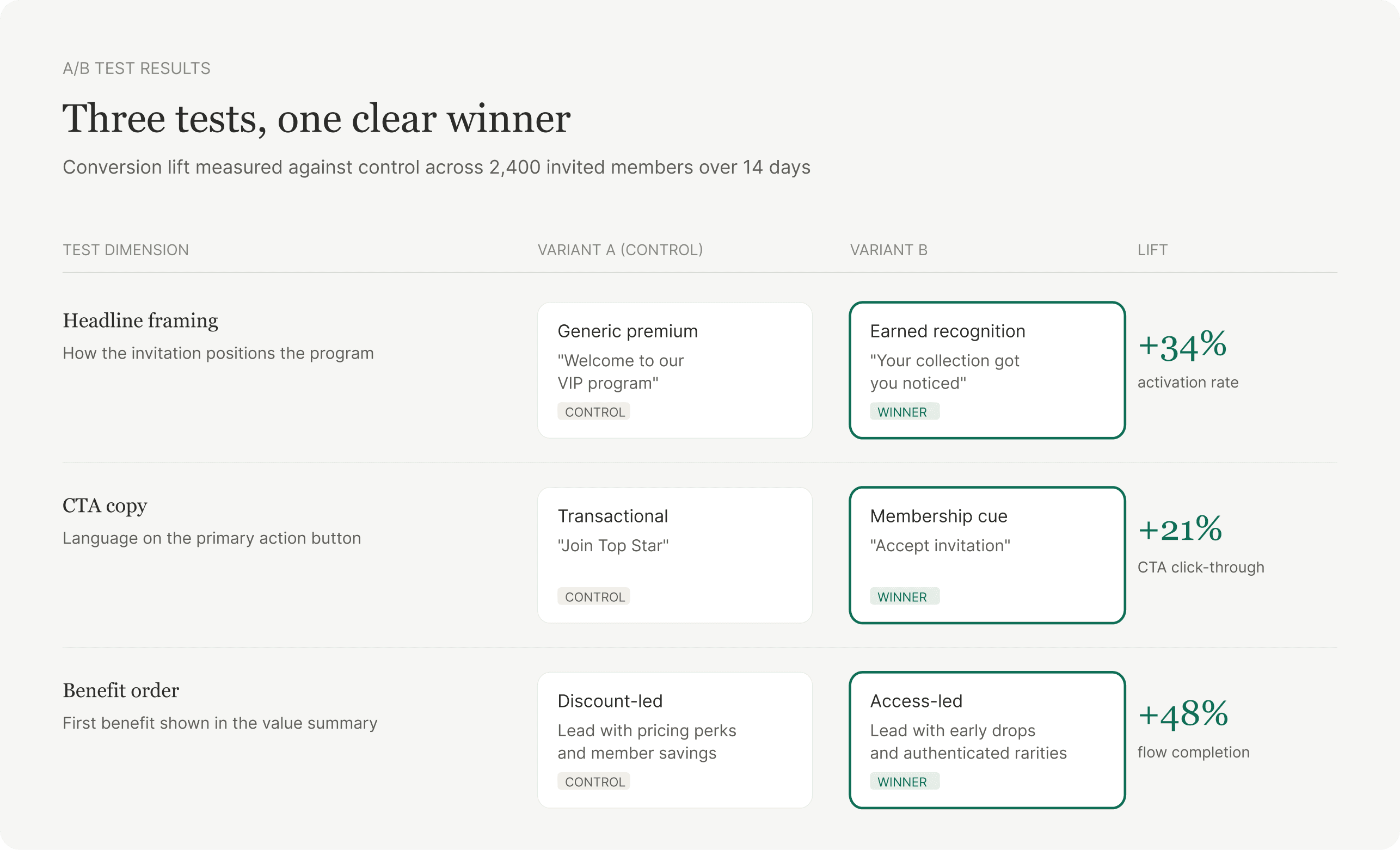
Headline framing
+34%
activation rate
Winner: "Your collection got you noticed"
Recognition outperformed status. Acknowledging what the user had already done converted better than promising what they would receive.
CTA copy
+21%
CTA click-through
Winner: "Accept invitation"
Membership language outperformed transactional language. Accepting an invitation felt exclusive. Joining a program felt like a sign-up form.
Benefit order
+48%
flow completion
Winner: Access-led: early drops and authenticated rarities
This audience does not shop for discounts. They shop for access. Leading with what they could get first, not what they could save, drove the biggest lift.
Impact
A premium experience that converted
The onboarding direction helped support a premium program for one of eBay's most valuable customer segments. It showed that conversion is not just a function of removing steps. It is a function of understanding who you are designing for and what they actually respond to.
For this audience, the right experience was one that felt earned, specific, and culturally credible. The test results confirmed it.
Reflection
What this project proves
This project demonstrates how strong UX for high-value customers requires both product discipline and cultural understanding. The best design decisions here came from research, not instinct: knowing that this audience needed to earn their way in, that access beats discounts, and that the language of sneaker culture is not interchangeable with generic loyalty copy.
It also reinforced something I apply across all my work: UX writing is design. The words on a button, the framing of a headline, the order of a benefit summary are all product decisions with measurable consequences. Treating copy as an afterthought is how you leave conversion on the table.
Next Case Study
ReviewsRight