Designing Enterprise Tools Across a 40+ Engineer Innovation Team
A large-scale enterprise UX engagement focused on simplifying complex workflows, partnering deeply with engineering, and building scalable product experiences across a broad innovation portfolio.
Some details are generalized or anonymized to protect confidential product, team, and organizational information.
- Role
- Product Designer
- Team
- Sole designer, 40+ engineers
- Scope
- 55+ internal apps and tools
- Domain
- Enterprise UX, Internal Tools, Engineering Partnership
The Problem
Enterprise tools that reflect system logic instead of user needs
Internal tools often fall far below the bar that consumer-facing products set. They expose system complexity instead of user logic. They fragment workflows across multiple interfaces. They assume users will figure it out.
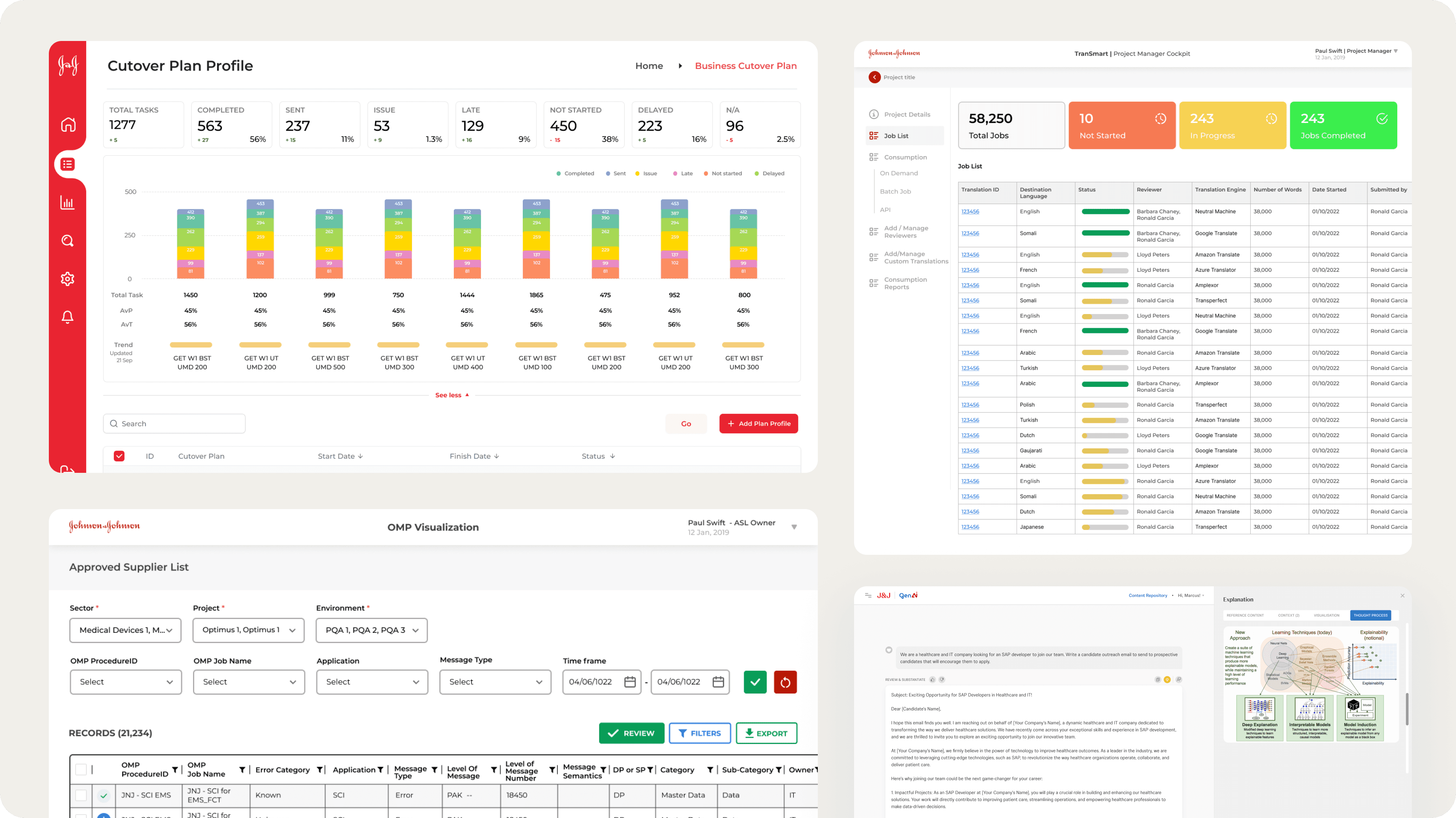
At Johnson and Johnson, I was the sole designer supporting a team of 40+ engineers across a large innovation portfolio. The team was building and maintaining tools for internal users: analysts, operators, managers, and technical teams with complex, often role-specific workflows. The challenge was not just creating better screens. It was bringing product clarity and design consistency into an environment moving at engineering pace.
Signature Challenge
One interface for a global supply chain
The most complex project in the portfolio was a global supply chain application used across multiple J&J regions. The design challenge was not just the technical scope. It was the human scope: each country operated under different territorial regulations, different approval hierarchies, and different expectations for how the system should work.
Before designing a single screen, I mapped every stakeholder group, documented the regulatory variation across regions, and identified where workflows overlapped and where they had to diverge. The goal was a single interface that felt equally usable to a team in Europe, Latin America, or Asia Pacific, without requiring separate products or custom builds per region.
The answer was a role-based, permission-aware system with a shared interaction model and region-specific data configurations underneath. The interface stayed consistent. The rules underneath it adapted. That separation made the product scalable without making it confusing.
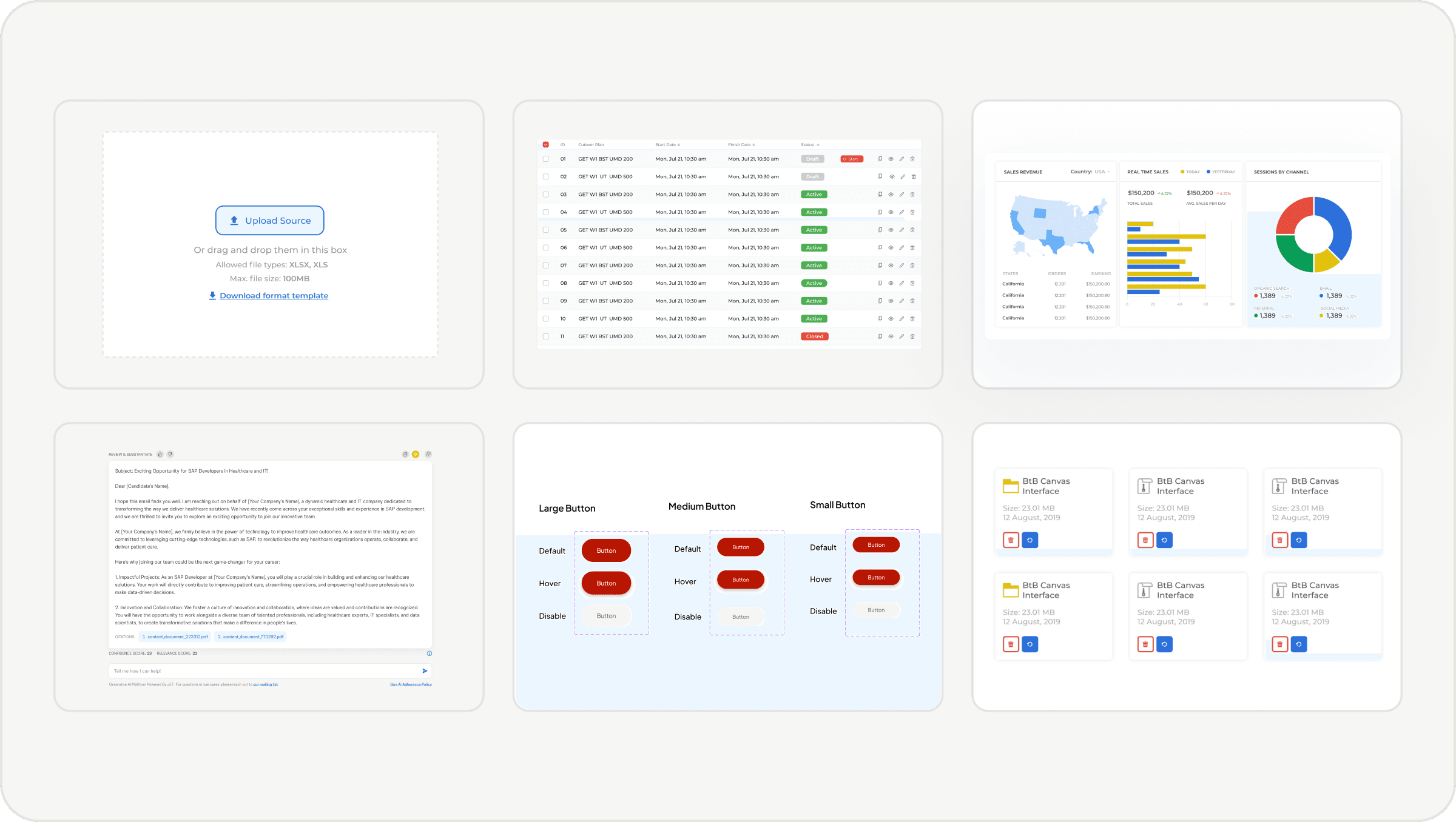
Representative visuals from the portfolio. Sensitive details removed.
Key Insights
What I learned designing at enterprise scale
Internal tools still need product quality
Enterprise users tolerate complexity, but that does not mean the product should be complex. Clear navigation, better hierarchy, and thoughtful states reduce frustration and improve workflow efficiency in ways that show up in the business.
Workflow decisions have more impact than visual decisions
Most internal tool problems are not visual. They are structural. Fixing information architecture, reducing unnecessary steps, and surfacing the right decision at the right moment mattered far more than polish.
Edge cases designed early prevent production problems
When states, permissions, errors, empty views, and edge cases are documented before engineering builds, teams ship with fewer surprises and less rework. That saved time on nearly every project.
Pragmatism is a senior design skill
The best design in a fast-moving engineering environment is not the most idealized version. It is the version that improves the experience, respects constraints, and can actually ship.
Engineering Partnership
Design that ships starts before the designs do
Working with 40+ engineers as the sole designer meant the process had to be practical, fast, and implementation-aware from the start. I did not hand off finished files and hope for the best. I built systems that made it as easy as possible for engineers to build the right thing without constant back-and-forth.
The result was fewer post-launch fixes, faster delivery, and products that matched the intent of the design because the intent was clear from the beginning.
Involved early
I joined scoping conversations before designs existed, which meant feasibility constraints shaped the direction instead of blocking it later.
Documented every state
Every handoff included loading, empty, error, permission, and edge case states. Engineers never had to guess what the product should do when things did not go as expected.
Built plug-and-play systems
Instead of designing one-off components, I built on existing libraries where they existed and created new reusable patterns where they did not. Engineers could drop components in without custom implementation for every screen.
Made trade-offs quickly
When constraints changed mid-build, I made design decisions fast. Keeping engineering unblocked was as important as keeping the design right.
Design Patterns
Recurring solutions across the portfolio
Across 55+ apps, the same core challenges appeared in different forms. Instead of solving them individually each time, I developed reusable patterns that gave the portfolio consistency and gave engineering a predictable starting point.
Operations Dashboard
Status, priority, exceptions, and next actions surfaced clearly. Role-specific views where needed. Empty and loading states that do not leave users confused.
Guided Workflow
Multi-step tasks with clear progression, save and resume behavior, validation states, and error recovery. Review before submission. Confirmation on completion.
Role-Based Access
Interfaces that adapt to what a user is allowed to see and do. Disabled states with clear explanation. Admin vs. standard user views. Audit trails where accountability matters.
Data Table With Decision Support
Complex tables made usable through useful default sorting, clear filters, inline status indicators, bulk actions, and empty and no-result states.
Exception Handling
Workflows that do not follow the ideal path still need a clear experience: error explanation, suggested next action, escalation path, and manual override when appropriate.
Impact
Clarity and consistency across a large engineering portfolio
By working closely with engineers and stakeholders, I helped move internal products from technical requirements toward clearer, more usable experiences. Being the only designer on a team this size meant every decision had to be practical, scalable, and right the first time.
The work improved product definition, reduced ambiguity during implementation, and helped establish design patterns that scaled across a broad portfolio without requiring a large design team to maintain them.
Reflection
What this project proves
This project shows how I operate when embedded directly with engineering in a complex, fast-moving environment. I am comfortable being the only designer in the room, turning ambiguous requirements into product direction, and staying close to implementation until the work ships correctly.
It also demonstrates something I believe strongly: enterprise products deserve the same level of clarity, usability, and craft as consumer products. Internal users are still users. Confusing tools slow teams down, create errors, and cost the business. Better design is not a cosmetic upgrade. It is an operational one.
A single designer can improve product quality across many teams and applications when the approach is systematic: clear workflows, reusable patterns, practical documentation, and a genuine partnership with the engineers who build it.
Next Case Study
eBay Top Star